Is a Beautiful Home only for the Wealthy?
Leafing through House Beautiful, Veranda, Traditional Home, Elle Decor, and other shelter magazines is a feast for the eyes. Room after room more beautiful than the last, stunning architecture, fabulous finishes, and all furnished with gorgeous furniture, rugs, and original art. The April 2010 issue of House Beautiful features a home steeped in romance and history, the kind of place you want to escape to when in your head you’re pleading, “Stop the world, I want to get off!” Maybe it is an illusion that life was simpler back then. It’s an appealing fantasy though, but I couldn’t live without my Apples – and I don’t mean the fruit. But I wouldn’t mind fooling my brain into thinking I was living a simpler life, would you?
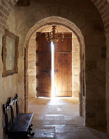
This is actually a new home in Texas magically transformed into a Tuscan farmhouse by designer Eleanor Cummings who used reclaimed wood, stone, and brick from Houston antiquities dealer Chateau Domingue. This home is seriously mellow. If this were my home, I’d feel like I’d gone to heaven. I was born under the astrological sign of Taurus which is an earth sign, so I consider it my birthright to love earthy, rustic interiors!
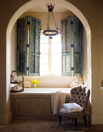
Can’t you just imagine lounging in this bath without a care in the world? The way photographer Eric Piasecki used the light really captures the ambiance of this home. Just looking at these photos relaxes me and makes me go, “ahhhh.” A virtual rustic spa experience!
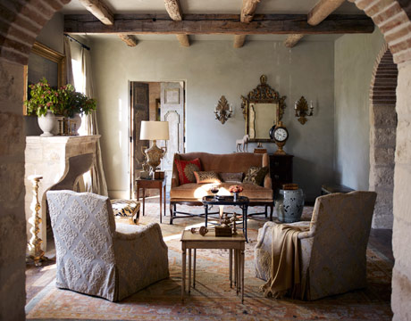
This living room seems made for after dinner conversation. Normally I am drawn toward bright, sunny rooms–after all, I moved to Florida for a reason–but this room has such a relaxed mood, I just want to sit by the fire and maybe even close my eyes and daydream.
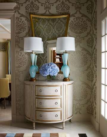
As much as I love Tuscan farmhouses, to truly indulge my design aesthetics, I’d need a handful of houses to call home. Maybe even two handsful. My sun sign may be Taurus, but my moon and rising sign are both Leo, the fire sign of glamour. So this entryway by Tobi Fairley just makes me go “ooooh!”
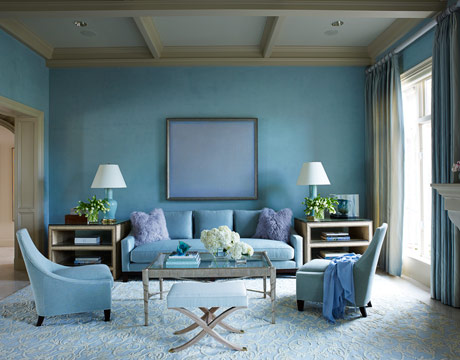
Such a deceptively simple vignette: large scale (Nina Campbell) patterned wallpaper, (Swank) Venetian glass lamps on a (Darnell) demilune commode by Amy Howard and the perfect mirror to add sophisticated sparkle. What a beautiful composition, all the objects are in perfect scale and balance and the juxtaposition of varying shapes is a visual feast for the eyes. And as in the living room below, I love how the warm and the cool blues play off each other. Imagine this room with only the warm blues, it would not have as much energy. And there’s just enough of the cool blue.
To me this living room says, invite some friends over for cocktails!
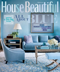
Tobi’s living room was featured on the March 2010 cover of House Beautiful.
I got so enamoured with both these gorgeous interiors that I almost forgot the subject of this post! Just shows how leafing through shelter magazines can be mesmerizing.
What I want to say is that you can have a home furnished with gorgeous custom furniture and draperies, exquisite antiques, Oriental rugs and custom finishes–and even after spending all that money, it still might not be beautiful. Why? Because a beautiful home is much more than the sum total of beautiful objects.
Yes, a Venetian plaster wall is more beautiful than paint. And it’s true that just about anything high end is more beautiful than its lower priced cousins. But there are a lot of lower cost alternatives that come close enough for those of us not blessed with a lush bank account. Good thing, or I’d be so sad.
Of course, 99% of the rooms in the shelter magazines are beautiful. Not everybody will like every room but to expect otherwise would be crazy.
That would be like Baskin-Robbins saying, “We’ve decided only chocolate is delicious, so we’re eliminating the 30 other flavors.”
It is always a good idea to at least consult with an interior designer (like me) and especially before buying big ticket items or having your house painted. Better to invest a little in professional guidance than waste a lot of your time and money having your living room painted three times because you got the color wrong, or wasting your furniture budget on a sofa that doesn’t leave enough room for an end table, don’t you think? Or even worse, spending your entire budget and ending up disappointed.



Very Good post. Thanks!!!!
[…] furniture has signs of age and wear and is not always in pristine condition. Images { 1 / 2 / 3 / 4 / 5 […]
Apple now has Rhapsody as an app, which is a large act, but it is currently hampered by the quality to keep locally on your iPod, and has a dreary 64kbps bit rate. If this changes, then it gift somewhat negate this welfare for the Zune, but the 10 songs per month faculty plant be a big quality in Zune Passport’ favour.
Please let me know if you’re looking for a article writer for your blog. You have some really good articles and I believe I would be a good asset. If you ever want to take some of the load off, I’d absolutely love to write some material for your blog in exchange for a link back to mine. Please send me an e-mail if interested. Cheers!
I’m sure that i will come back here. Well written articles !
Great read.. This will be my 1st time to your website. Greatful for sharing this. I have to subscribe to this blog. I am a pool repairman for 5 years. Our do-it-yourself tip of the century is this: Please do not attempt a hard work job solo. This will cost you lots more in the end. Thank you once again.
Good day, well done blog. Want to get paid for blogging? Check out: http://bit.ly/PaidWriting
Excellent publish.Suchfascinating read and details, thanks for sharing this post, I have already bookmarked your blog. I can see that you are putting lots of time and effort into your weblog and detailed articles!
I trust you would not have reservations if I posted a part of this site on my univeristy blog?
What is your university blog address?
I like to read your blog a couple times a week for new entries. I was wondering if you have any other niches you write about? You’re a very interesting writer!
Great post. I thought that the Ballard calalog with styling by Suzanne Kasler showed that you can use reasonably priced elements that have good lines and good style, and create a beautiful room. the good news about design today is that there are so many more ‘things’ that are reasonably priced and available to everyone. I walked through a Restoration Hardware store this week and was amazed at what they had on display – so beautiful, and quite reasonable!
So true, your example of Suzanne Kasler’s styling using Ballard Design products perfectly illustrates how it’s possible to decorate with well designed furnishings and accessories that are also reasonably priced. There are more options out there than ever before. Thank you for stopping by! Anne
Many thanks with regard to your time and effort.My spouse and i really enjoy looking at well written articles and blog posts dealing with living room furniture,living room accessories and décor. In reality We are getting ready to do some re-decorating and am definitely very happy to find brand new recommendations. Especially if they can help save us some bucks not to mention make our living room look good as well.
A well-written post, Anne!
Yesterday, I was part of a panel, at High Point University, where we discussed social media and the effect it has had, and will have, on the home furnishings industry as well as the scope of interior design. The virtual world isn’t far away, where consumers can use programs to place furniture, create holograms of a sofa – and in their own living rooms! They can change the fabric and “move” the furniture with a click of the mouse. (And even more amazing, maybe with a special set of glasses or a microchip.) While this sounds a bit disconcerting, I believe there will always be a need for a designer’s eye to help disseminate all of the information needed to make wise choices for design solutions.
Are interior design services for all of the masses? I don’t think everyone perceives our value. Will there be some who benefit from having secured our services? Absolutely! The spaces you’ve featured in your photos, above, are a clear reflection of that.
Thank you for sharing your panel experience at High Point University yesterday, Wanda! The design horizon is looking amazing!
As HGTV has enlightened consumers that they can have a beautiful home (and that a beautiful home is not only for the wealthy), and as more homeowners want to be intimately involved in creating what I like to call interior beauty, there will be more opportunities for homeowners to be involved. And this will require educating homeowners. But even if consumers were to spend the years we have in studying interior design, the vast majority would still benefit from hiring an interior designer. Why? Because being able to play the cello does not make one Yo-Yo Ma! The ability to select a sofa in a more user friendly way still doesn’t mean that the resulting sofa will be the best choice of style or fabric or color or even size. But I’d love the ability to show my clients a hologram of a sofa in their living room-what a great tool to help them visualize my recommendations!
A beautiful home is not only for the wealthy. It is also for the people who have thoughts that are too deep for a saucer, who can dream in color, who are inspired by music, pictures, views, and the voices of children. These people also know that beauty is not mass produced.
Recently I shared a hospital room with a nice, but very provincial, woman. She had not been too far from her hometown, ever. She and her visiting friend thought it was perfectly acceptable to, are you ready for this, cover the windows in their homes with aluminum foil to keep out the heat! It was all I could do not to scream. It caused me far more pain than my little surgery. The idea to do this had never occurred to me. Later, I saw some houses that were using the foil technique…it is not, definitely not…pretty. What would this woman do if she walked in to a beautiful home?
I hate to say it, but perhaps there are some people for whom a beautiful home is not desirable.
Very eloquently stated, Rissi, you speak poetically! Beauty is in the eye of the beholder, but stories like your foil lady show that not everyone sees or appreciates beauty. What they are missing! It’s like someone eating food without having taste buds. Thank you for sharing your observations.