A Goldilocks Rug
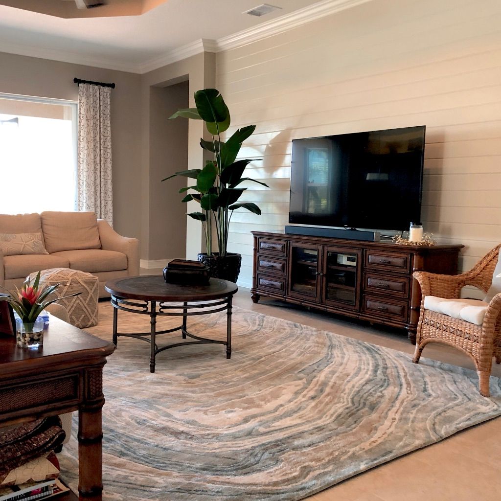
One reason homeowners call me is because they know something is not working in their space and they want need help creating the ambiance they desire.
Often homeowners have invested hours and hours in searching and shopping. And when a purchase doesn’t work to change the room into the haven they’re trying to create, then comes the schlepping the item back to the store, or worse, repacking, and then schlepping to The UPS Store, and often paying to ship it back. Designing the space of your dreams sure isn’t as easy as it looks on TV.
In this case, these homeowners wanted to replace their bold, high contrast, black, cream and gold rug.
In a design consultation, we narrowed down their wishes. They knew they wanted something that would reference their Florida location but was still relatively neutral and subtle…but not boring either.
We also discovered what they didn’t want. That’s just as important! No seashells or starfish, and not too dark.
As an interior designer, I have many, many sources for just about any kind of furniture, lighting, mirrors, custom furniture and built-ins, art and accessories, and oh yeah, rugs. Way more options than most retail stores, and more special too. So I knew right where to look.
With a good understanding of their wishes, I showed them several large 18″ x 18″ samples so they could see the patterns and colors in their room. Large samples also allowed them to see the quality of the rug, how it was constructed, and how soft it was underfoot.
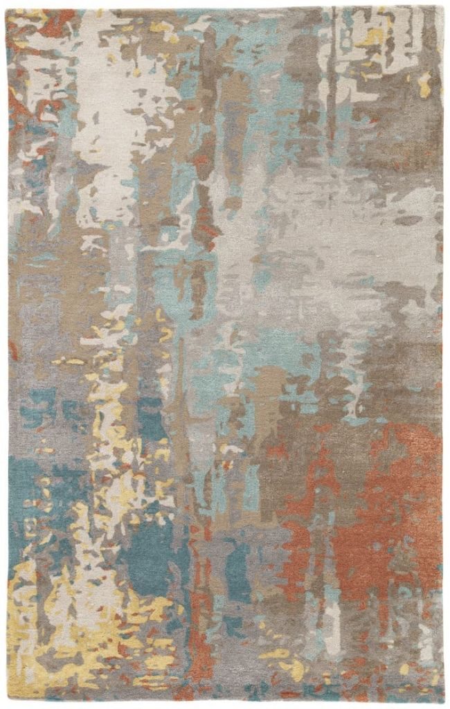
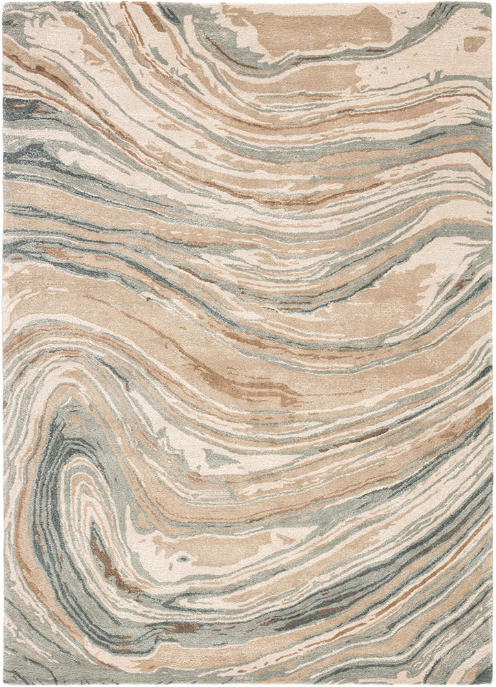
After a debate between these two patterns, and with my recommendation, they chose the second gorgeous rug. The swirling pattern is reminiscent of ocean waves lapping on a sandy shore, and the deep blue green adds color without being bold or overwhelming. And it definitely isn’t boring. In fact, you could say it’s juuusst right!

Also important is that the neutral colors coordinate with the furniture, floor tile, and wall colors.

They are extremely happy with how their sophisticated new rug has transformed their great room into a room they now feel great about. And because of my over 14 years of experience and great sources, I was able to make this happen in just 2 weeks, start to finish.
If you want to transform your home into a beautiful space you love spending time in, call me to see how I can help make that happen.
Designers & Details
Designers have to be detail oriented. Why? As the famous German-American architect Ludvig Mies van der Rohe said, “God is in the details.” In other words, it’s the details that make or break the design.
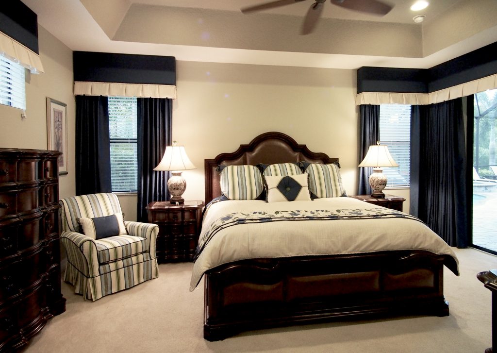
Here is a master bedroom drapery and bedding design that includes draperies, cornice, slipcovers, duvet, pillows, and a scaldino.
Here is the rendering to show the clients how their bedroom would look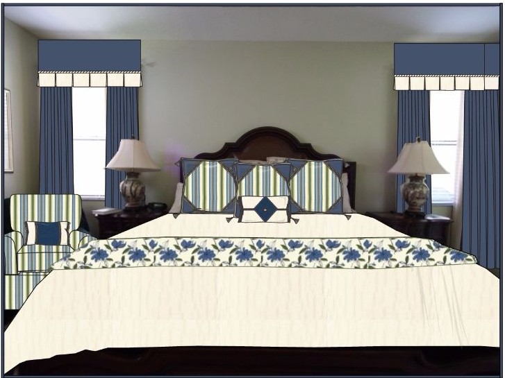
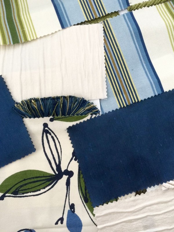
With a color palette of sapphire blues, spring greens, and ivory, I combined 5 fabrics, 4 different size and color lip cords, a brush fringe, a gimp, and 12 tassels to add the finishing details.
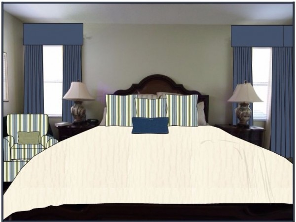
As a comparison, here’s how the same basic design would look minus the details.
Looks unfinished, doesn’t it?
Details are the difference between mediocre and sublime. And who wants mediocre design?
If you’d like to add some Interior Beauty to your home, I look forward to hearing from you!
~Anne
And for those who are wondering, a scaldino is literally an Italian brazier, a portable ceramic container shaped like a basket with handles. Back in the days before central heating, people would stay in the kitchen as long as possible, dreading the ice cold beds that awaited them. After the kitchen fire had been burning all evening, there were plenty of glowing embers. The last person to go to bed would scoop them into the scaldino, put the scaldino inside a rounded structure of wooden slats called a trabicco, then slide the whole contraption under the sheets and blankets for about 5 minutes to warm the bed before moving onto the next bed and the next bed and finally their own bed. The air in the Italian stone houses was humid which meant the sheets were damp, and once the scaldino heated up the bedding, columns of steam would arise from the bed and the bed appeared to be on fire! But it was just the steam. The warmth of the bed didn’t last long, so people hoped they’d fall asleep before the bed became ice cold again. Nowadays we use a scaldino to mean the decorative fabric piece at the foot of the bed, which can indeed warm your toes, just not as much as a scaldino! (taken from Trapped in Tuscany, a book by Tullio Bruno Vertini)
Wilsonart at ICFF
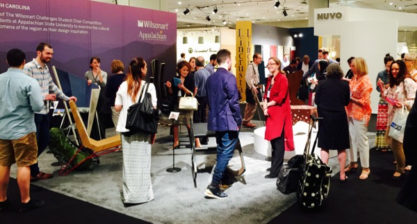
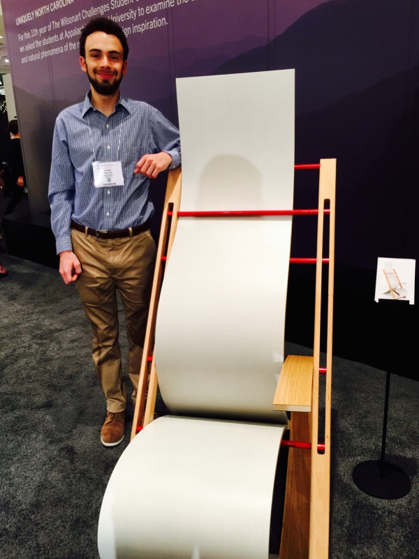
The first day of ICFF, our first stop was Wilsonart to see the chairs conceived and built by student designers at Appalachian State. In its 11th year, Wilsonart sponsors and challenges design students to create chairs that celebrate the richness of laminate surfacing materials without the restraints of mass production. Wilsonart chose the Industrial Design Program at Appalachian State University to host the 2015 challenge. The theme of this year’s challenge was to celebrate the beauty, culture, and history of the Appalachian Valley of North Carolina.
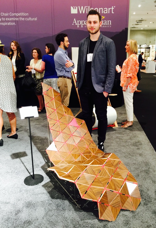
I first talked to Rider Evans about his Triad chair that uses triangles and hexagons to form a sling-like seat supported by a stainless steel rod frame. These shapes form the shape of the state of North Carolina, with the red triangle representing Boone, where Appalachian State is located. The triangle motif was also a hallmark of Buckminster Fuller, one of the America’s greatest designers of the 20th century, who taught at Black Mountain College in Asheville, NC. Fuller’s geodesic dome was constructed wholly of triangles and hexagons. I like how Rider placed the Wilsonart laminate in a way that suggests parquet.
“Hem” as a noun means a border, edge, or margin, but as a verb, it means to confine or enclose. Lyndsie White created her Hem chair to, “sweep around your body much like the arms of your mother, or the cradle of a front porch.” She spent a lot of time on her motorcycle exploring the Appalachian Mountains and became fascinated with the self-sufficient and hard-working people she met there, as well as the buildings that were weathered yet remained intact. 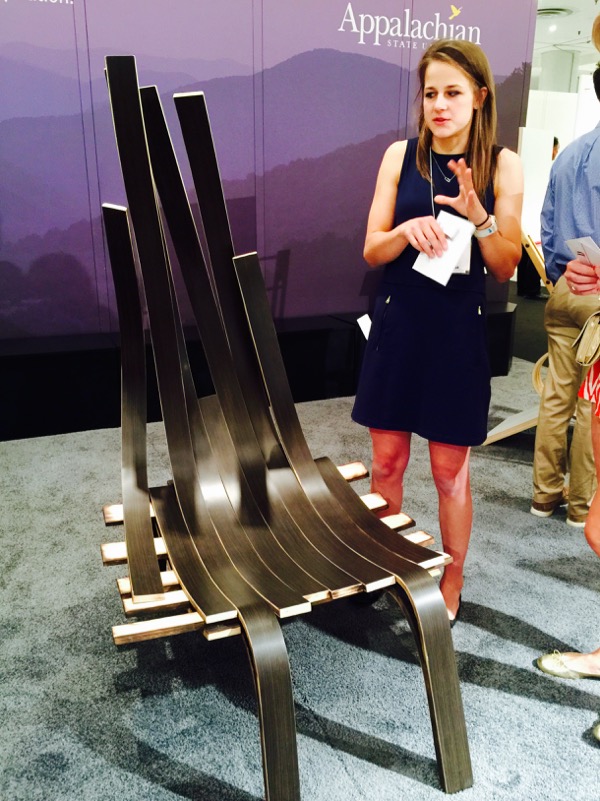
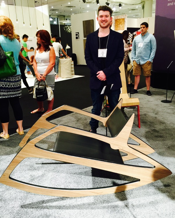
Having grown up in the Blue Ridge Mountains of NC, Alex Ravan was inspired to create his chair Sequoyah by memories of his childhood when he and his father were in the Indian Guides program. They visited the mountains to learn about the people living both on and with the land. His rocking chair reflects Cherokee ideology, where Mother Earth, the land, cradles all human life.
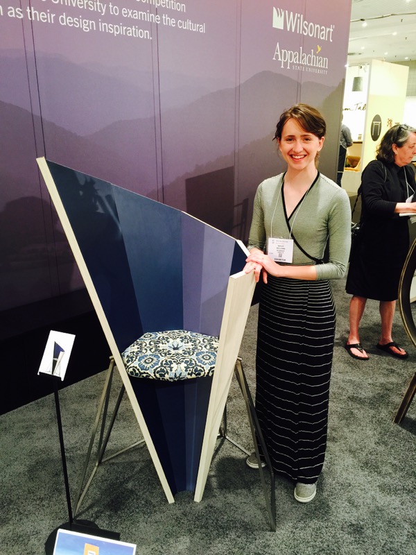
When creating her Advent chair, Bailey Williams was inspired by the Moravian star on several levels. One reason is because her ancestors built and founded the Moravian community in NC in 1768. Another is because she’s intrigued with its many points and angles and its interplay of light and shadows. The first Moravian Star was created for a geometry class in 1850; its angles and lengths used as a lesson in math. Originally the stars were used as decorations during the Moravian Advent season, but now it’s common to see them decorating homes any time of year.
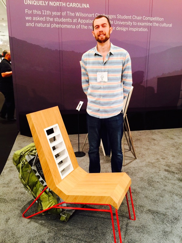
As a hiking enthusiast in the Blue Ridge Mountains, John Walters created his chair to solve a problem. What do you do with your pack once you’re ready to sit? He figured chairs have backs and shoulders just like humans, so he created the Trek chair to shoulder the load. He designed a hooking device and put it on the back to accommodate a full backpack. No need to fling the pack on the floor, now it can hang securely on the chair. He chose tubular aluminum for the legs much like the framework of a backpack, and the back is slotted to allow both the pack and the hiker to air out.
Looming is the name Byron Dollar gave to his chair as it simulates the flow of fabric through a loom. The frame of the chair symbolizes the shuttle that sends weft threads through warp threads to weave the fabric. In a larger sense, design involves weaving the physical with the emotional; just as one finds tactile comfort in a favorite shirt, good design finds the perfect fit and balance between man and nature.
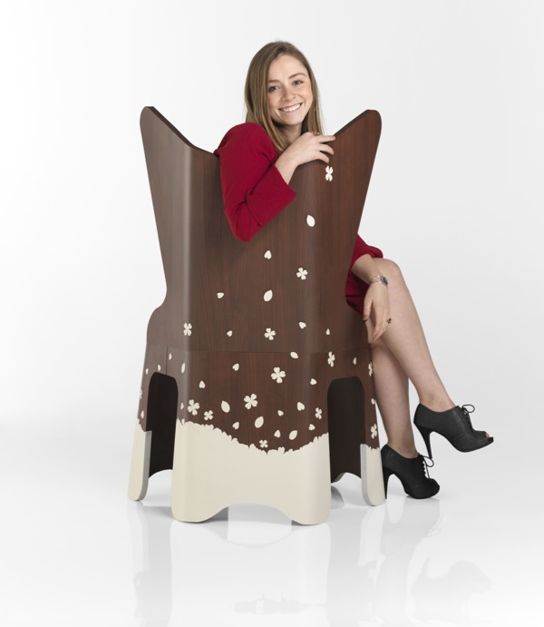
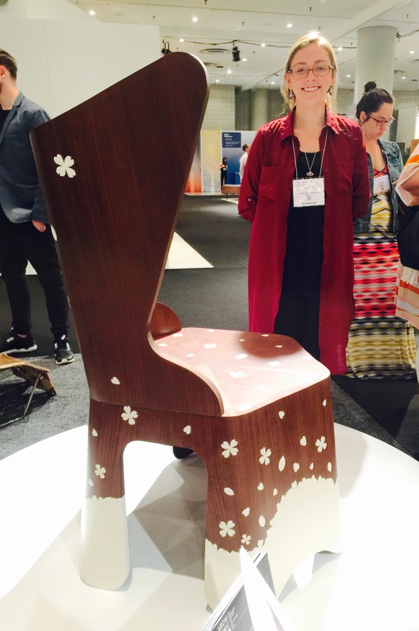
Samantha Lilly’s chair Blossom won the Wilsonart Challenge because it embodies the spirit of the Appalachian region through its use of marquetry applied to resemble the flora natural to the area, specifically the blooming Dogwood tree, the state tree of NC. The Wilsonart Laminate in Persian Cherry provides the appearance of natural woodwork but without the concerns of crafting with genuine hardwood, allowing designers more freedom and the ability to explore original shapes and employ new techniques.
Samantha says she wants to “bring you back to a childhood when a typical day might consist of getting lost in the woods and making believe that magic exists in all variety of flowers and trees.” When sitting in her chair, she wants you to feel as though you are being immersed in nature.
Congratulations to all the student designers (who have now graduated from) Appalachian State, and best wishes as you continue your careers in design! Kudos to Wilsonart for fostering furniture design in North America!
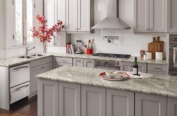
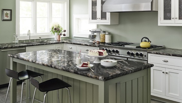
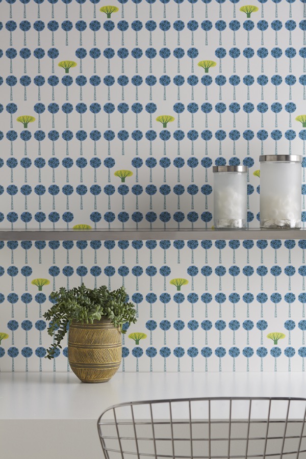
I remember laminate counters in the home I grew up in, but have you seen laminate surfaces lately? Technology has permitted more sophisticated patterns, to the point where you have to touch them to know if it’s laminate or stone. Here are just a few examples of a new Wilsonart designs:
Wilsonart x You Custom Design Service is an exciting new program that allows designers, architects, and specifiers to quickly and easily create their own signature designs in laminate counters, wall panels, tables, work surfaces, case goods and more. You can have your own design on just one piece, or hundreds, in a surprisingly short 2-3 weeks after artwork file approval.
Imagine the possibilities! Use oversized graphics to create dramatic wall panels or accent spaces within a room. Think of the opportunities to underscore brand identity in retail shops, medical offices, and commercial settings. Design is increasingly moving to more personalization, and Wilsonart is right on the leading edge.
Did you know that Wilsonart also makes gorgeous quartz surfaces?
What is Quartz? Quartz is a hard mineral composed of silica and oxygen and is the second most abundant mineral found on earth.
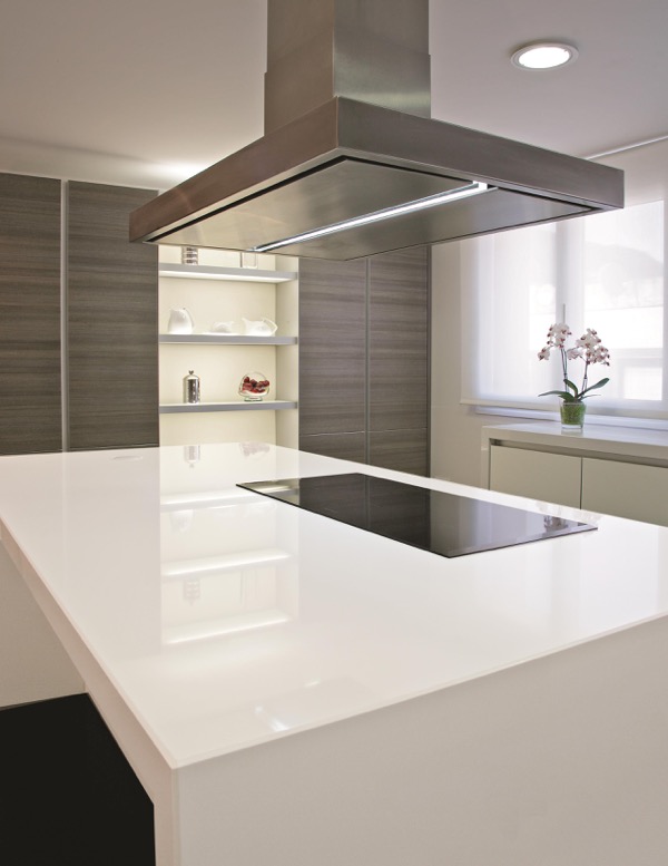
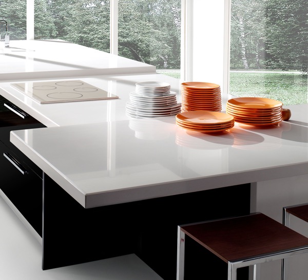
Wilsonart calls quartz counters the doppelgänger of stone. Quartz counters are engineered stone formed by combining 90% ground quartz with 8-10% resins, polymers, and pigments. This forms a very hard granite-like surface. Wilsonart creates quartz counters that simulate the beauty of natural granite but are much less maintenance. Quartz counters don’t need to be sealed like natural stone, and all that’s required for cleanup is mild soap and water. This is why I prefer Quartz to natural stone: beauty and low maintenance!
Quartz counters also are cool to the touch like granite and marble, something I appreciate, living in Florida.
Wilsonart has many sophisticated patterns in all styles, whether modern or traditional.
The veining in these Wilsonart quartz counters is quite beautiful.
For more than 50 years, Wilsonart has been an eco-friendly manufacturer.
- 30% of the fiber used to make their laminate comes from recycled sources and is certified by SCS Global Services.
- They sponsor ZeroLandfill communities and Silver sponsor for Save-a-Sample program.
- They’re the largest donor to local United Way organizations in Central Texas, and a
- Major fund-raiser for Scott & White Children’s Hospitals.
- Wilsonart was the first North American laminate manufacturer to achieve the Forest Stewardship Council Chain of Custody of Certification,
- They have also achieved UL Greenguard Gold Certification for low chemical emissions on all laminate types.
Clearly, Wilsonart is an upstanding citizen among corporations and care about the earth’s resources and keeping their products healthy!
A great big THANK YOU to Modenus and to Wilsonart for a wonderful experience on #BlogTourNYC! To see more about Wilsonart, click here. And to follow along on my BlogTourNYC experience, see my posts Smart & Sexy in the Bathroom, A Steamy Afternoon in New York City, and Someone’s in the Kitchen at Kips Bay Decorator Show House. And if you’re thinking of updating your kitchen or bathroom with new counters, I hope to hear from you!
Smart & Sexy in the Bathroom
Friday night, #BlogTourNYC was invited by LAUFEN Bathroom to attend the #DIFFA1.2 Party. DIFFA stands for Design Industries Foundation Fighting Aids and the 1.2 refers to the 1.2 million people living with HIV. A girlfriend who was infected by her fiance is still alive and kicking thanks to all the research devoted to fighting this disease, so I was doubly happy to attend this party.
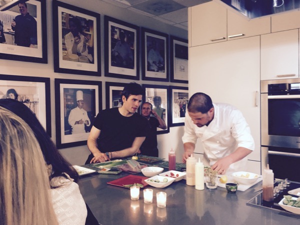
The party took place at the DeGustibus Cooking School inside Macys.
The chefs prepared delicious delectables that were…
…served by handsome men. Here’s one of them offering culinary delights.
The big smiles on my #BlogTourNYC designer friends Anne Edwards, Amy Wax, Ann McDonald, and Deborah von Donop are a testament to the great time we all had. The images of certain other BlogTourNYC members dancing and singing shall remain in our collective memory!
After a great time at the DIFFA party, we made our way to the street to wait for our Uber driver. New York was buzzing and the streets were full of people.
Here you can see the entrance to Macys.
The 3 Anne’s of #BlogTourNYC on our way back to the NYLO hotel. Me, Ann McDonald, and Anne Edwards.
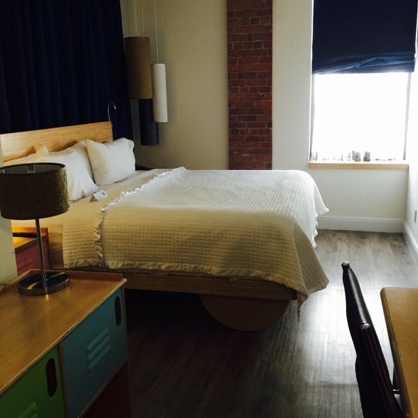
Did I mention that we each had our own private room at the NYLO Hotel? The bed was sooo comfortable that I wanted to bring it home. Hardwood floors in a hotel room, seriously? I couldn’t believe all the lighting options either; usually hotels are notoriously underlit. It was a great room. Thank you again, Modenus (aka Veronika Miller and Flo Von Pelet), and the BlogTourNYC sponsors: LAUFEN, Mr. Steam, Wilsonart, and Dacor!!
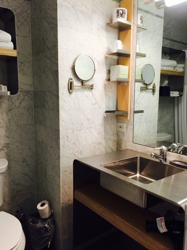
The NYLO bathroom also met with my approval as it was well designed with all the amenities and thoughtful space to hold my toiletries. My personal preference is for a ceramic sink but stainless is a natural choice in this industrial chic design.
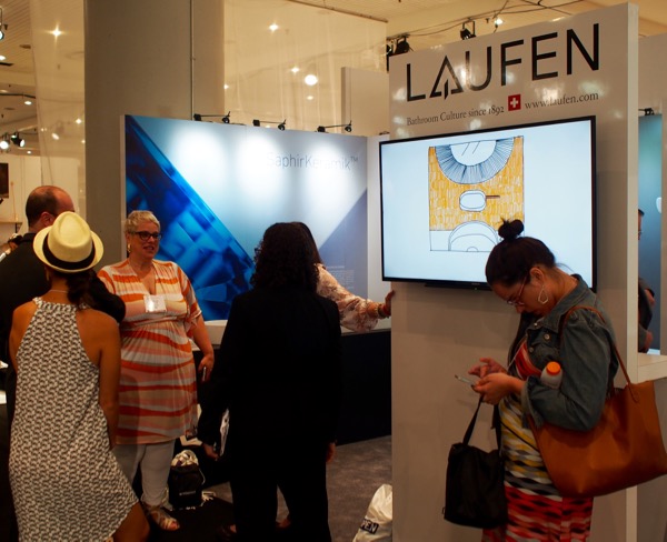
On Sunday, we went to the ICFF design show and visited LAUFEN at their booth.
LAUFEN is a global expert when it comes to manufacturing bathroom ceramics and faucets. For over 120 years, LAUFEN has been using ceramics to make innovative products in state-of-the-art plants with legendary Swiss precision. And their collaborations with great designers from around the world have resulted in truly beautiful bathroom products.
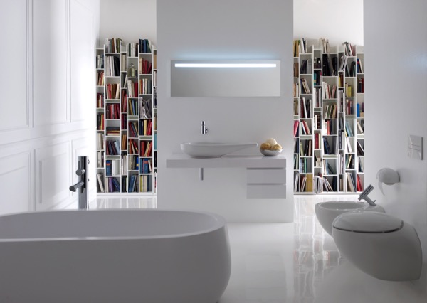
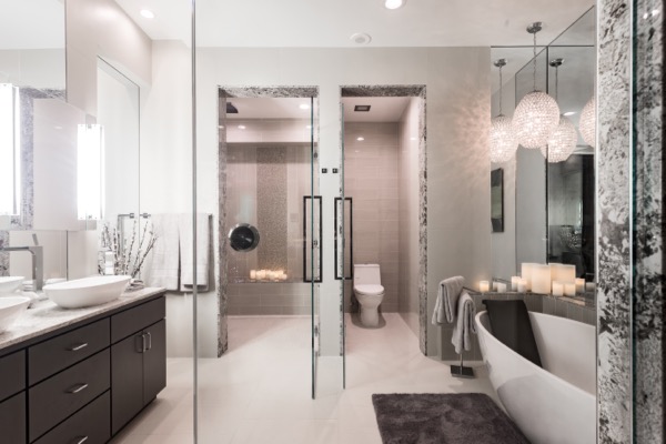
The bathroom below is from the collection Ilbagnoalessi One, LAUFEN’s partnership with Italian designer Stefano Giovannoni. His inspiration was in how water smooths stone, how pipes make water useful, and how both have reflective surfaces. This bathroom has a sleek yet organic ambiance. Delightfully organic and sexy!
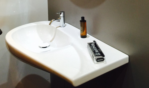
Here’s a photo I took of the sink at ICFF. I love how the feeling of flowing movement is captured in the ceramic.
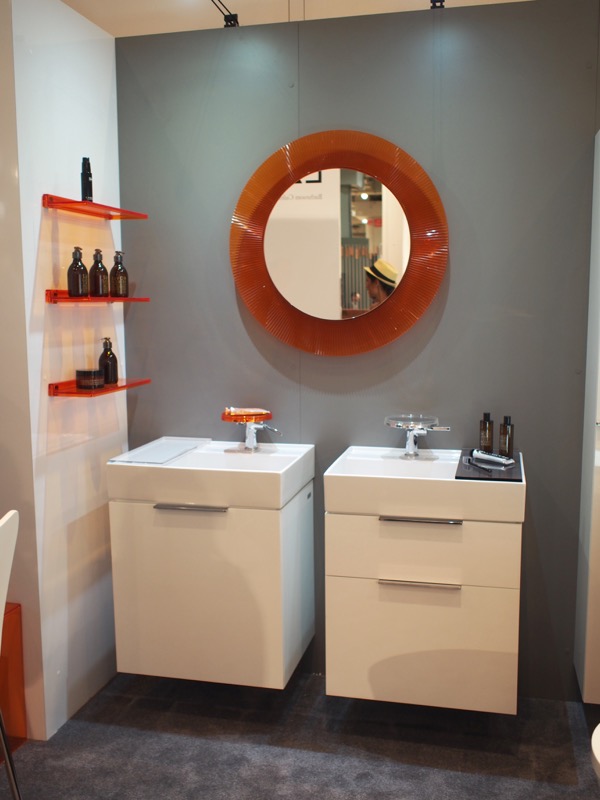
LAUFEN also partnered with iconic Italian design firm Kartell, known for their color and revolutionary use of plastic materials in furnishings. The vanity cabinets below are ingenious for making every inch count. In typical Florida homes, storage is often insufficient. Wait til you see how these work.
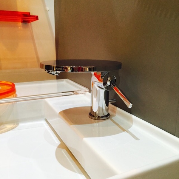
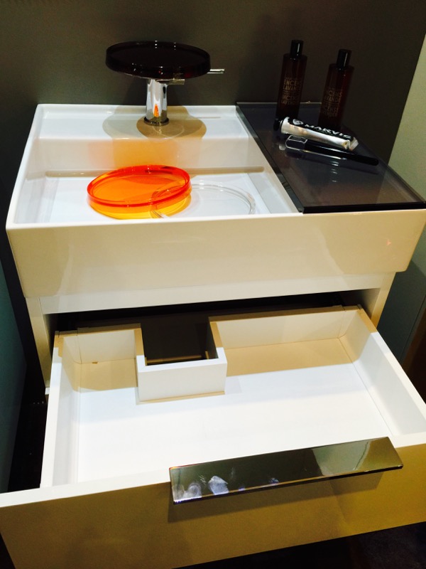
Let’s start with the faucet. The round disc on top is a shelf.
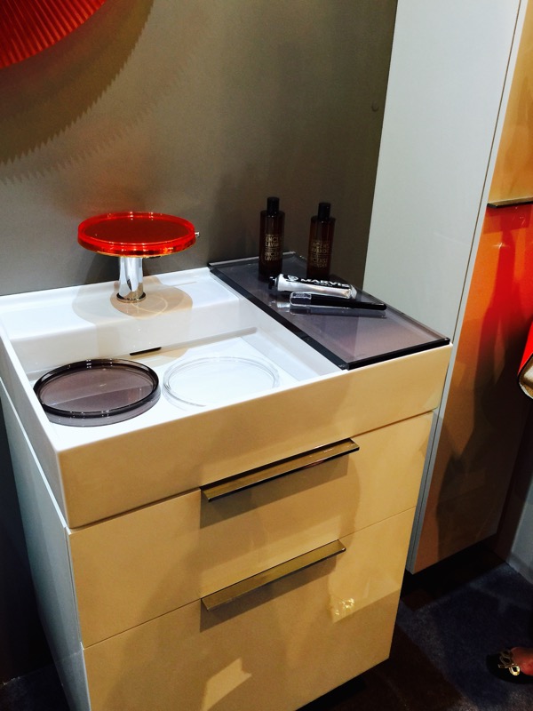
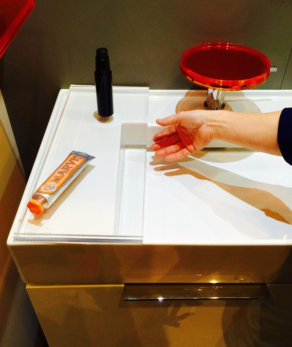
The shelf holds a removable plastic tray that sits securely on the shelf and is not dislodged or bumped when turning the water on or off. The plastic has a very substantial and sturdy feel. The trays come in 4 colors: orange, gray, clear, and blue (not shown in this pic) There’s also a rectangular tray, also removable, that also…
slides on either side of the faucet.
Usually a bathroom vanity cabinet is such a waste of space because the entire area around the plumbing can’t be used. Inside this Kartell by LAUFEN vanity, the drawer is constructed around the plumbing. So smart! It’s just big enough for all my make-up, LOL. Seriously, bathrooms need all the storage possible, and this cabinet makes every inch count.
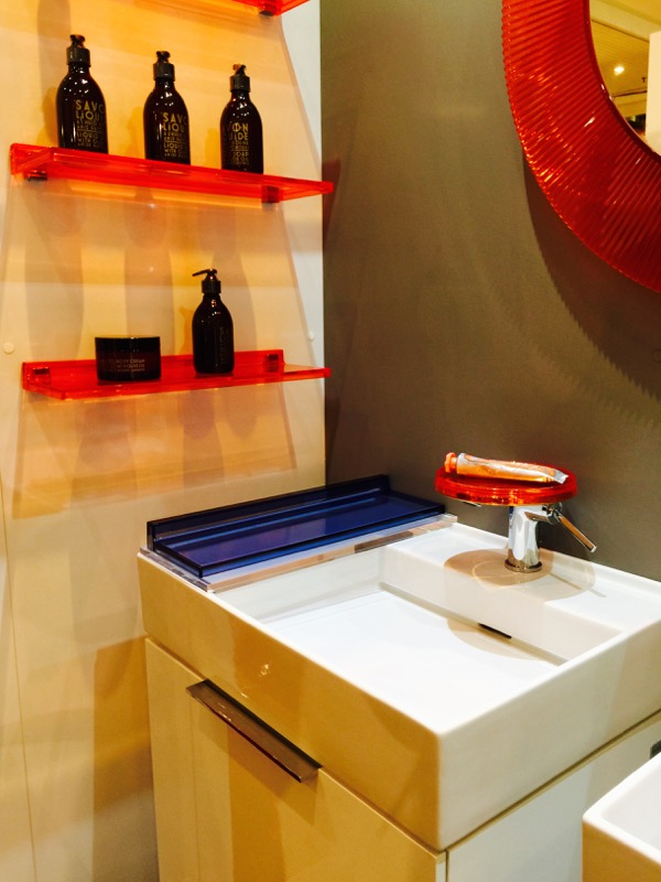
Here’s the blue color and the companion wall shelves for even more storage. (The blue is actually one of the wall shelves sitting on top a clear sink sliding shelf.) Now did you notice how thin the walls of the sink are? Besides looking sleek, the thin walls also give more basin space which = more splash space which = less tiresome wiping up of counters. That little slit in the ceramic is actually the drain!
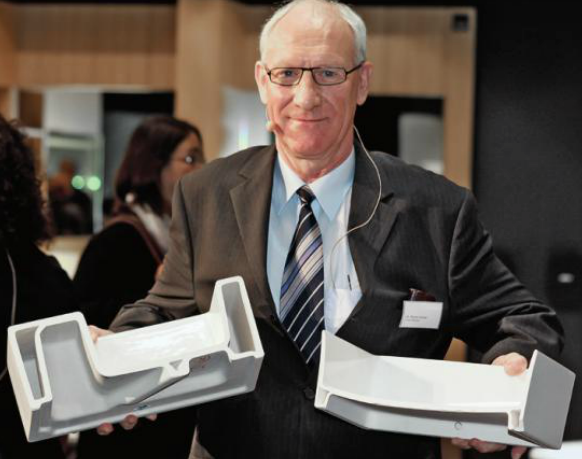
Using the mineral corundum which is found in sapphires, LAUFEN developed SaphirKeramik, an innovative new ceramic which was five years in the making. Because SaphirKeramik is super strong and has greater flexural strength than steel, it opens up entirely new ways to design sinks, bathtubs, toilets and bidets, because now these items can be 1/3 to 1/2 the thickness of current ceramic bathroom products.
Dr. Werner Fischer, Research Director of LAUFEN, shows the new SaphirKeramik (right) in comparison to conventional ceramic (left.)
Using a thinner ceramic body and a simpler structure reduces the weight compared with conventional ceramic. Lower raw material costs and energy consumption in production and transportation help preserve the earth’s resources, including one of our most precious natural resources, water.
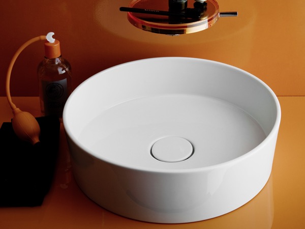
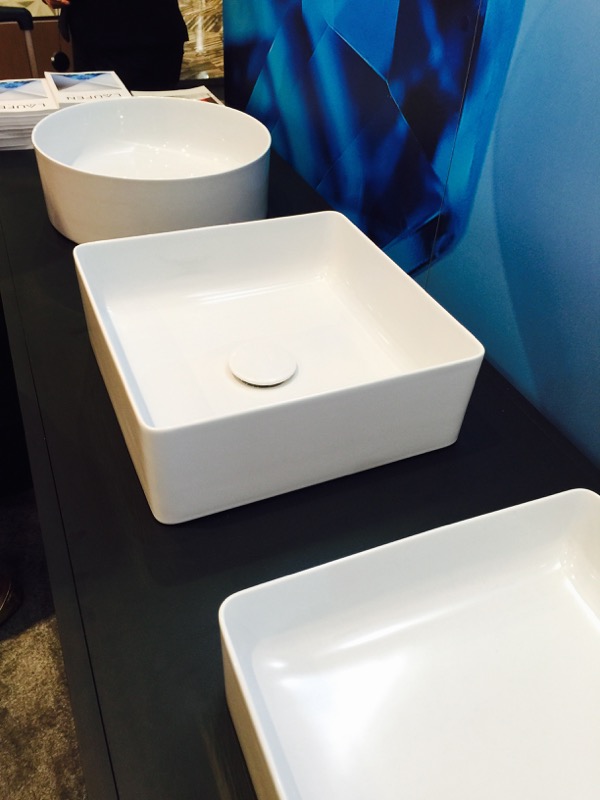
The super sleek walls of this vessel sink are made possible with SaphirKeramik.
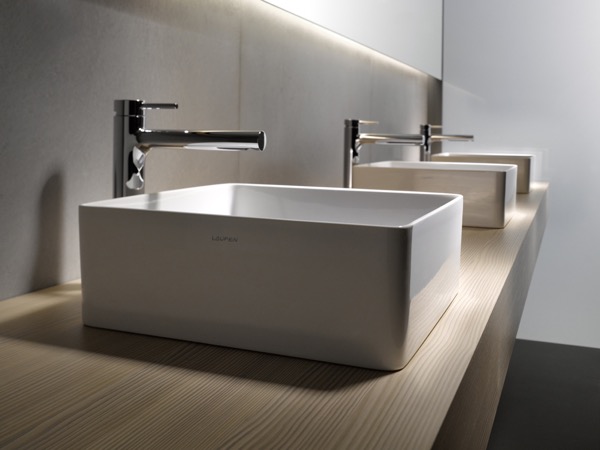
The inside of this sink is curved for easy cleaning.
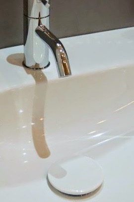
One thing you don’t see is the typical pop up drain that looks fine new, but over time discolors. In many LAUFEN sinks, the drain is a ceramic disc.
In these 2 photos (taken by fellow BlogTourNYC designer and friend, Anne Edwards) you can see the ceramic drain cover in this LAUFEN sink.
And it’s removable for easy cleaning! Why aren’t all drains like this? 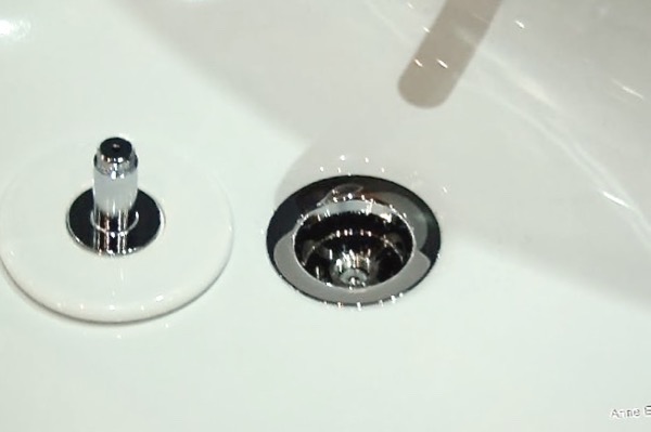
The drain is an integral design in this LAUFEN sink. Virtually invisible and so much easier to keep clean.
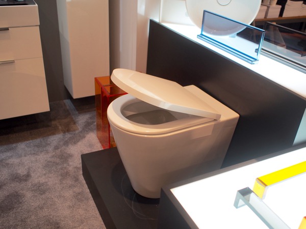
I also love the sleek side walls of this toilet, no nooks and crannies to collect dust. Can you tell I don’t like cleaning? The lid lowers softly with a gentle nudge. No more slamming toilet seats.
Clean lines, intelligently designed with an organic feel that preserves our natural resources, LAUFEN is sure to show up in my next bathroom designs. Can I help you create this in your bathroom?
Thanks again to LAUFEN Bathroom for sponsoring a wonderful #BlogTourNYC, an experience I adored, and for showing us how bathrooms can be so beautifully and smartly designed! To see more about LAUFEN and their beautiful designs, click here. To see more about my design experiences on the BlogTourNYC, see A Steamy Afternoon in New York and Someone’s in the Kitchen at Kips Bay Decorator Show House
Someone’s in the Kitchen at Kips Bay Decorator Show House
Who’s in the kitchen? #BlogTourNYC, that’s who. BlogTour is the brainchild of Veronika Miller of @modenus as a means to bring interior designers, bloggers, and other creatives together to explore selected design brands and to share their take-aways.
Besides being ahead of the curve and brilliant and witty, Veronika apparently has the knack of picking people who get along great despite the fact we came from all over the world, are all different ages, have different occupations and vary widely in style. If she had any spare time, she’d make a great party planner. Oh wait, this four day BlogTour was a party! By the last day of #BlogTourNYC, we’d all become good friends. So for that alone, Veronika, I thank you for inviting me. So come along with me while I share my wild design ride for 4 days in New York City, the Holy Grail of all things design.
Do I need to mention Veronika Miller’s uncanny ability to photobomb and look good doing it? While there was a lot of work involved, (I can hear you saying, “yeah, yeah”) there really was, honest! But there was a lot of fun too. Obviously.
Our first design destination was the famed 43rd Annual Kips Bay Decorator Show House at the Arthur Sachs Mansion in Manhattan. The show house was decorated by 22 celebrated interior designers to benefit the Kips Bay Boys & Girls Club.
#BlogTourNYC members enjoyed early access, sparkling mimosas and a delicious frittata muffin conjured up by Chef Oliver in a state-of-the-art, gorgeous Dacor oven.
Chef Oliver putting the finishing touches on our breakfast frittatas.
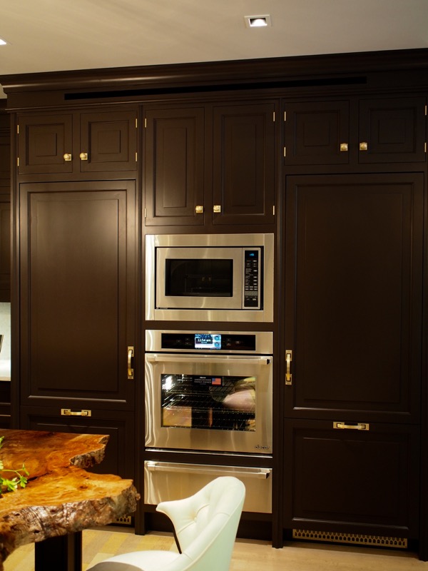
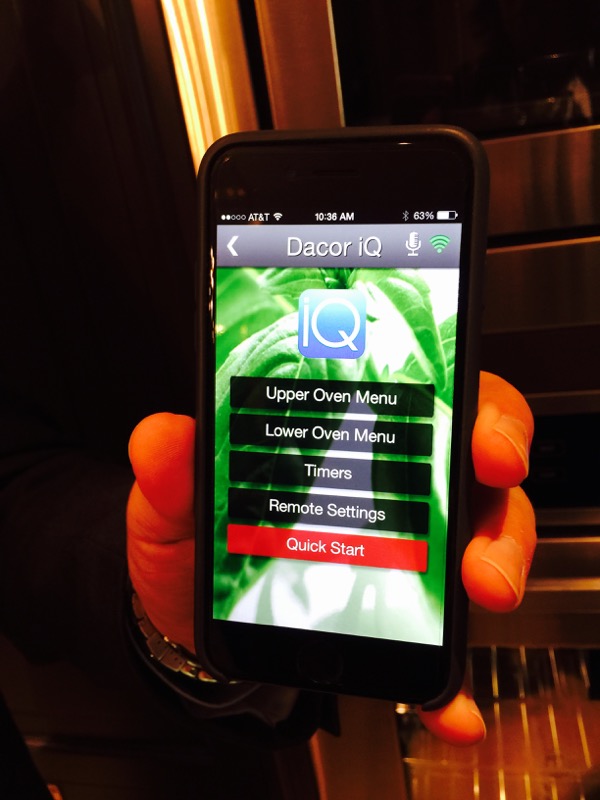
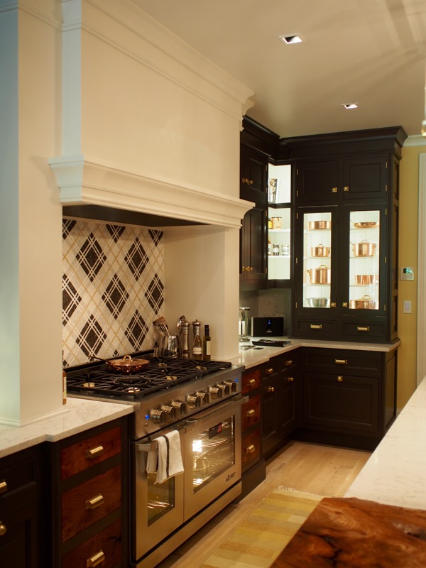
This Dacor oven looks beautiful nestled in the Christopher Peacock custom cabinetry, but it’s smart too. It has an IQ controller for access to the Dacor IQ Remote App, for the ultimate in smart technology.
The Dacor IQ Cooking App allows you to remotely control the oven (or range) via your smartphone or tablet–and even via voice commands for hands-free operation. Great when you’ve got your hands full. You can even set it to start preheating before you get home.
It has a Recipe Box to easily store recipes found online directly into the oven or range. Then the oven can tell you exactly what to do to cook dinner perfectly. No more ruined roasts!
Dacor Discovery IQ also has advanced diagnostics to aid in optimal performance. Plus it’s just plain beautiful and adds to the high end feel of the Christopher Peacock kitchen. It’ll even text you when dinner’s ready!
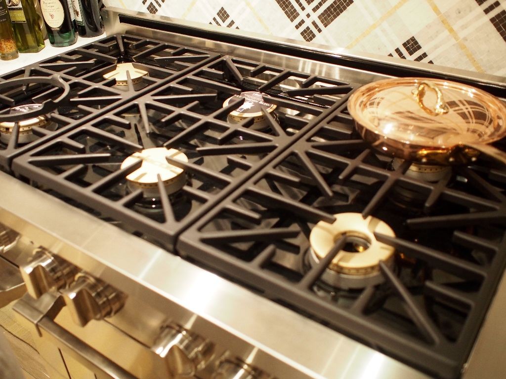
This Dacor Renaissance 48″ gas range says a serious home chef lives in this kitchen. The Illumina oven and burner knob controls light up and have a ProGrip design and stainless finish. The SoftShut hinges pull the door softly closed, no slamming.
What makes the Dacor range especially impressive is that it has burners that go as low as 800 BTUs for a true, controlled simmer that won’t scorch your Beef Bourguignon, and the same burners can also go as high as 18,000 BTUs so you can really sear a steak and keep the juices in. The burners are sealed and the spill basin is porcelain enameled to make clean-up easy. (music to my ears!) The grates are designed to make one continuous platform, so when you’re done with a hot and heavy pot, you can just slide it off the hot burner instead of having to pick it up. Are you noticing a theme here? Yes, I confess, I like cooking to be E-A-S-Y.
The oven accommodates commercial-sized baking sheets and pans and has a huge window so you can monitor your cookies. Another feature I especially like are the GlideRacks that fully extend on a gliding ball bearing system. Great for those 20lb turkeys or big pans of lasagna. No more “nails on a blackboard” screeching while forcefully pulling out heavy racks. Safer, too. It just dawned on me that the reason that this range is called Renaissance is because it’s so versatile, it can do it all 🙂
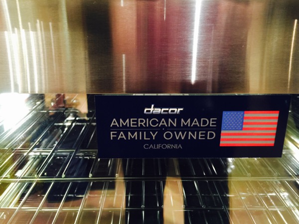
For 50 years, Dacor has been designing and building its ultra-premium kitchen appliances in California. It’s also the first and only ultra-premium appliance brand to be tested and recommended by the Master Chefs of Le Cordon Bleu, the world’s most respected culinary arts and hospitality educator. Now that’s an endorsement!
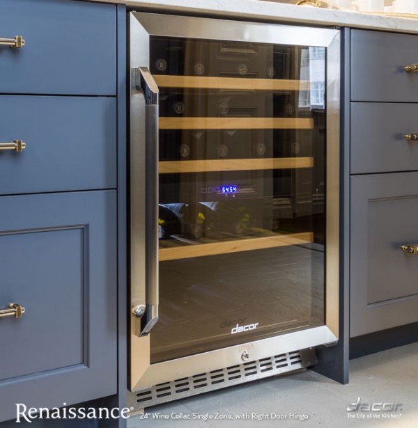
Do you drink wine? Red or white, the Renaissance 24″ Wine Cellar holds up to 46 bottles that slide out effortlessly on beechwood racks. Like both red and white wine? Choose the dual zone model and it’ll keep the temperature and humidity perfect for both.
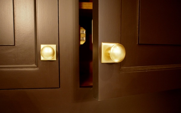
This kitchen is a work of art, with the ultra high end Dacor appliances and the custom Christopher Peacock cabinetry. I am a hardware geek and love the feel of solid brass pulls. Note the large base of the knob to protect the finish on the cabinet door, and the solid brass catches.
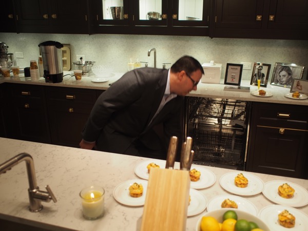
This is a large party kitchen, it has two Dacor 24″ dishwashers, and I like how they’re integrated into the cabinetry. Six cycles clean whatever you load in it, and WhisperWash feature does what it says.
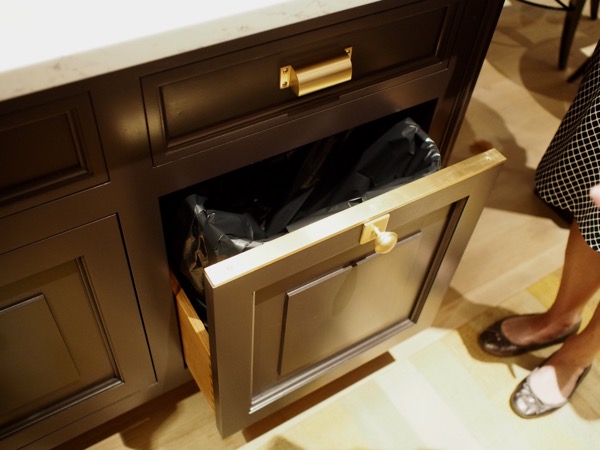
Thoughtful features like the metal strip on top of the trash receptacle door protect the cabinetry finish.
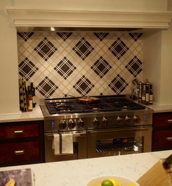
I noticed a plaid theme happening in the Kips Bay Decorator Show House, starting with this distinctive backsplash design over the range.
Floor to ceiling cabinetry provide great storage and display space.
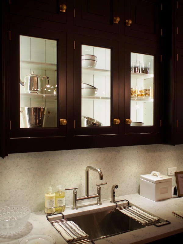
Upper display cabinets are shallow to allow head room at the sink.
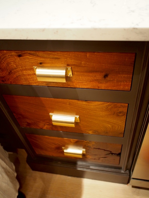
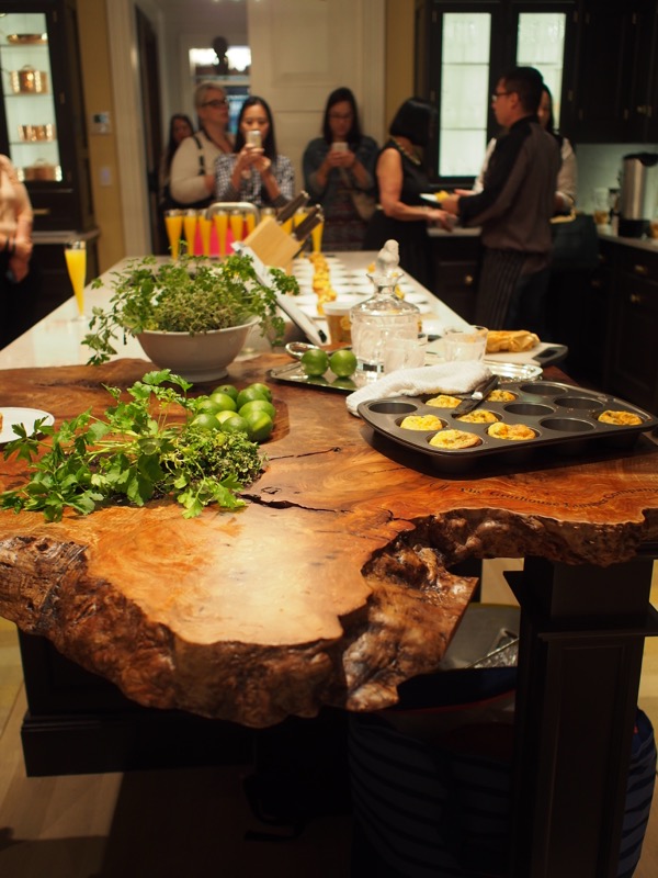
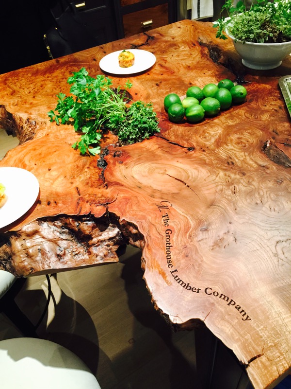
These drawer fronts are from the same piece of solid wood used to make the live edge island counter, and they are set off beautifully by the solid brass pulls.
Loving all the shiny smart technology mixed in with Mother Nature at her finest!
The beauty of this live edge counter brings nature into the kitchen. Isn’t the graining spectacular?
Sending a HUGE hug and thank you to Modenus for inviting me along for all the #BlogTourNYC fun, and to Dacor for sponsoring our breakfast visit to the Kips Bay Decorator Show House 2015! After learning about all the smart features in their products, their tag line makes sense–The difference is in the details. Dacor is in the details.
I hope you enjoyed this little tour of the kitchen at #KipsBayDecoratorShowHouse2015. Watch for my next post that will be about the next most important room in any home–the bathroom.


