The Art of Dressing Windows
Each spring, I make a point to attend the International Window Coverings Expo (IWCE) because it is the premier trade show for the Custom Window Treatments industry. The best and most creative window fashion designers and fabrication artisans come together to learn, to share, to network, and to look for new resources for fabrics, trims, and hardware, both decorative and functional. If I want to see the latest innovations in fabrics and products used “behind the scenes” in making window treatments more functional, energy efficient, and yes, beautiful, IWCE is where they will be found. If I want to see the latest advances in “hard” window coverings, including motorization options and how to make sure window treatments are safe for children and pets, IWCE is the place to go. If I want fabric custom printed, if I want beautiful hand-finished drapery hardware designed to surmount the problems of poorly designed window architecture, if I want to see the latest modern drapery hardware systems, if I want to see anything that’s new in window treatments, I go to IWCE. To learn anything and everything about the design and fabrication of window treatments, IWCE is the place to go. And if I want to be awed and inspired by the transformation of flat fabric into beautiful and creative window fashions, IWCE is the ONLY place to go.
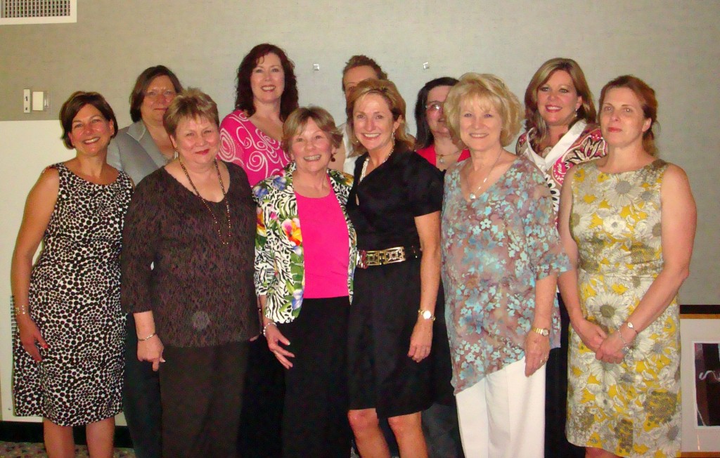
Another reason to go is to be with my colleagues. It is an adrenaline rush to be with other creative artists who want to be the best they can be. We inspire each other.
The people who fabricate window treatments deserve a better appellation than “workrooms” a term which doesn’t begin to convey the knowledge, skill, problem-solving and math required to fabricate window treatments. I know how to sew some window treatments and it’s time-consuming and painstaking work, and that’s true even for the “easy” window treatments.
Every year, I make the investment in my education to attend IWCE because creating beautiful window treatments requires a great deal of knowledge, for example in knowing what fabrics play well together, which will drape, which will hold a crisp pleat, etc., etc., but also in ensuring that the treatment will be in correct scale and proportion to the window and to the room. As a Window Fashions Certified Professional, I am proud to know that I am among the elite window fashion designers and fabrication artisans who strive for excellence and are committed to continuing education.
If you have ever tried to sew clothing for yourself and been disappointed in the results, then you have learned the frustrating lesson that what looks so easy is in fact quite difficult. And even if you were able to master the technical challenges of altering a pattern to fit your unique proportions and were actually able to sew it with a high degree of technical proficiency, you may still have learned the painful lesson that a perfectly sewn garment does not guarantee that it will flatter your figure. There is a reason why clothing that has been tailored for you is more flattering than an off the rack garment. And it’s even more flattering when the garment has been designed and sewn “from scratch” just for your figure, your coloring, your style, etc. So it is with window treatments. One can buy window treatments just about anywhere from Walmart to Pottery Barn to higher end retail outlets, but they are still ready-mades, still “off the rack”. They will look good in certain rooms on certain size and shape windows but they are pretty much one size fits all. They are almost always too skimpy except for the narrowest of windows. And not many people have the design expertise to know what style, size, color, fabric, pattern, etc. will look great in their home. But a Window Fashions Certified Professional designer does. And that’s why I’m here at IWCE.
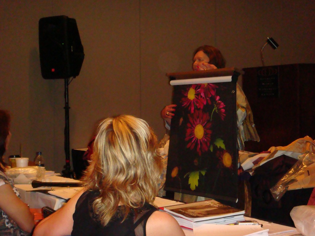
Today at IWCE, I spent 6+ hours in a seminar given by the queen of haute couture window dressings, Deb Barrett, who discussed the principals of design and how they relate to designing window treatments, as well as the insider tips needed to design and specify window treatments that will relate to the window and the room and that thrill our customers with what I call the experience of interior beauty (hence the name of my blog). Deb then shared numerous window treatment samples inspired by the latest designs shown at Maison Objet in Paris and Heimtextil in Frankfurt, as well as by new trims, fabrics, and printing processes. Our eye cannot help but travel to the window in any room. It makes sense then to make sure that the natural focal point of any room is treated appropriately, whether its style be modern minimalist or Rococo.
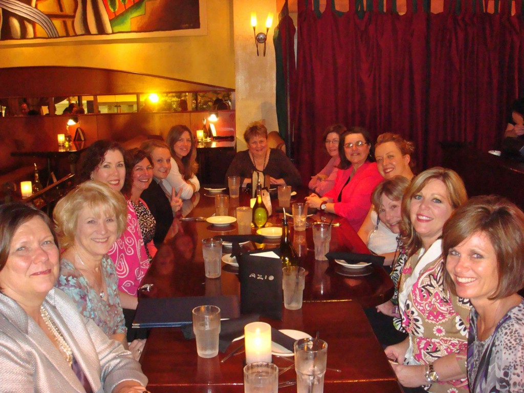
The WFCP Advisory Board, of which I am a member, had its board meeting to discuss how we can increase awareness of the value of custom window treatments and the WFCP program. After a lively discussion we came up with several ideas. Then we headed over to Azio’s for dinner.
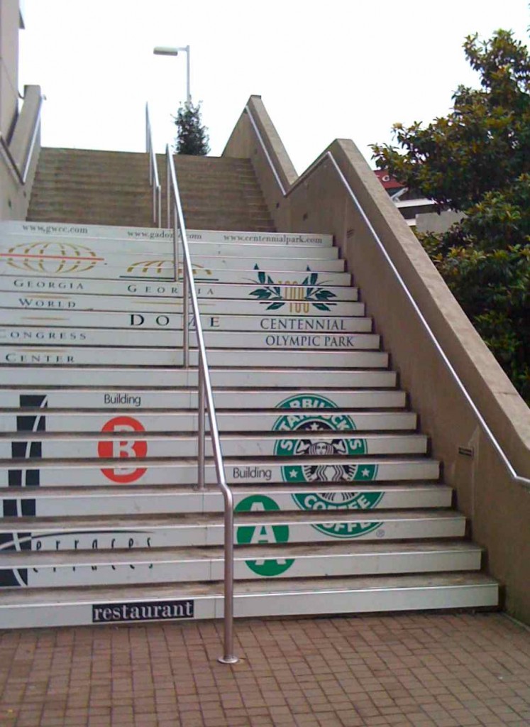
Thursday will be another busy day taking seminars on color influences and trends and what distinguishes couture and custom draperies. Then, after a special business coaching session, I will be wandering the show floor seeing and learning what all our wonderful vendors have for us this year. It’s been an exciting day and I’m finally wound down enough to sleep. Tomorrow morning when I head over to the Georgia World Congress Center for my first seminar, I’ll look forward not only to another exciting day, but also this:
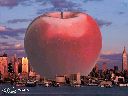
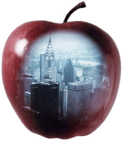
The Other Big Apple
As you can tell from my prior posts, I love Apples. One of my apple loves is New York City, the #1 Big Apple.
Here’s the surprising explanation of how New York City got to be called The Big Apple.
But the other Big Apple is also dear to my heart. I’m referring of course to Apple, Inc.
For an interesting little history lesson on how the Apple logo came to be, visit Edible Apple.
My love affair started with a Mother’s Day gift a few years ago, a snazzy iPod engraved with love from my kids.
The iPhone then followed and the convenience of being able to check email, get directions, access my contacts, was a godsend.
The fun progressed to a MacBook Pro laptop so I could make presentations to my clients. I signed up for mobile me and it was like a miracle that all my information updated automatically on both my iPhone and the MacBook.
Using my Apple was just so darn intuitive, I was hooked. I signed up for the One-to-One training and it was fantastic. 52 weeks of personal training to learn anything and everything I wanted and needed to know about using my Apple – and the people are so darn nice at the Apple stores. My only regret is that I didn’t switch to Apple sooner. I still have a sour memory of going into a Gateway store to pick up a computer for one of our kids. The salespeople there couldn’t have made it any more obvious that they didn’t give a you-know-what about us. At that time, I still had my desktop PC but increasingly neglected it, preferring to use my Mac even though the screen was only 15″. I’d never have thought I’d fall in love with a computer, but I’m never ever ever going back to PC.
Last year for my birthday, my dream came true and I was the ecstatic owner of an iMac with a 27″ screen.
The PC went in the giveaway pile (after the hard drive was scrubbed clean) and I haven’t missed it one iota. On the iMac, I can have multiple windows open and actually see them all. I can have my design rendering software up, multiple browser windows open, and iPhoto and PhotoShop open and a year later, it still runs like lightning. And I think it will be a looong time before I make a dent in the 4 gigs of memory. We also bought an Apple Time Capsule and it’s been working like a charm. That’s what I like, computer equipment that does the grunt work while making it easy to do the fun stuff.
So the latest Apple is the iPad, with 1 million of them sold in 28 days. Do I need one? Not really. Do I want one? Of course! Once again, Apple creates amazing products with features we didn’t even know we wanted – yet.
The very cool iPad here. If you’re considering getting an iPad, here’s a review of the Wi-Fi only vs. the Wi-Fi with 3G.
My next post will be more on my adventures in this Big Apple!
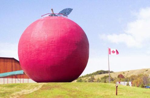
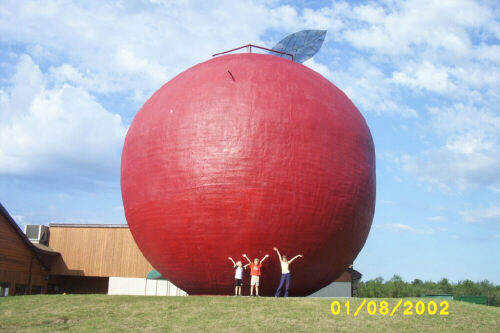
Before I go, I want to share this pic of a literally big apple. This structure is a restaurant – pie bakery built in 1987 in Colborne, Ontario on the starting point of the Apple Route scenic drive. It is 35 feet high and 38 feet wide, could hold 653,800 real apples and the Big Apple Oven could bake 144 pies at once. In 1995, about a half a million people visited this Big Apple.
Cute photos of kids “holding up” the Big Apple
I enjoy a good apple pie, but I’d rather visit New York City any day!
Party Time!
Spring is here (although in Florida it’s starting to feel like summer) and that means it’s time to party! Need some inspiration on how to decorate your party table? Or even what kind of party?
Here’s an easy and inexpensive source of inspiration that will perk up any table. They’re called “Themenaps” and they are napkins that stand up (you can almost imagine them cheering!). They come in an endless array of colors and themes. Some styles you can even personalize so they serve as place cards too. Just write your guests’ names with a Sharpie and unlike most napkins, the ink won’t run. Pair these chic napkins with fresh flowers and votive candles and voila! your table is well on its way to being decorated.
One of my favorite motifs is birds. I adore bird themes in fabric and wallpaper but honestly, it’s a little surprising because I had a “traumatic experience” with a bird when I was 11. I was at an older girl’s house trying to soak up some coolness and she had a pet parakeet. While we were sitting on the floor having cookies and milk (seriously, I even remember the kind of cookie and I still look for them, no luck so far), the bird escaped its cage and landed on my head, with its little claws grabbing my hair. Being the poised preteen that I was, I immediately screamed and tried to swat it off, earning me a sharp rebuke from the girl’s grandmother. Fortunately the bird was nimble enough to escape the swat, we both fully recovered and now I just love birds!
This says “Happy Spring” to me!


These are perfect for a graduation party! My son just gradated from the University of Florida and my daughter (also a UF grad) will be getting her Ph.D in Chemistry from Penn State this fall so I’m planning a Double Grad Party and plan to use these on the tables.

Or maybe I’ll use the blue
How about a wine tasting party? I’m always up for wine!

Or Coffee Klatsch? I’m always up for coffee too!
Cute for a bridal shower or Weddings

And isn’t this cute for a mom-to-be?

I love these for the mix of patterns and colors. And you can use a Sharpie to write your guests’ names (in your best calligraphy of course) and the ink won’t bleed

My son was craaaazy about Toucans when he was little. How cute is this?

Loving the pink, green, black and white and what a cute place card too

chic girls’ night out? Or for the woman who is turning a birthday ending in a zero (someone who’d appreciate the reference to sexy?

Of course, for Birthday parties!

or just having friends over for cake and coffee


Can we have a party to celebrate a successful shopping trip?!
(and yes, I do love pink with black and white!)

Or this for an afternoon tea party? (I also love pink and green)

Lest you think they don’t have themes geared for men – these are perfect for that special outdoorsman for Father’s Day.


Next time I host the annual face-off between the Florida Gators and the Florida Seminoles, these will be a great way to choose sides! It’s no secret that
I’m proud to be a Florida Gator!


How bout a 4th of July Party?

Or a Fireworks Party?

4th of July
Summertime is fast approaching, how about a beach or pool party?

Summertime...
There are lots of reasons to party coming up:
- Cinco de Mayo (May 5 – tomorrow!)
- Graduations
- Mother’s Day (May 9)
- Memorial Day (May 31)
- Father’s Day (June 20)
- Independence Day (July 4)
- Halloween, Thanksgiving, Christmas, etc.
ThemeNaps are made in the USA from eco-friendly 100% recycled tissue and FDA-approved food grade inks. And they’re inexpensive, under $10 for a gift box of 16. Visit them at www.themenaps.com
So what kind of party are you planning?
Touring the Upper East Side of New York City
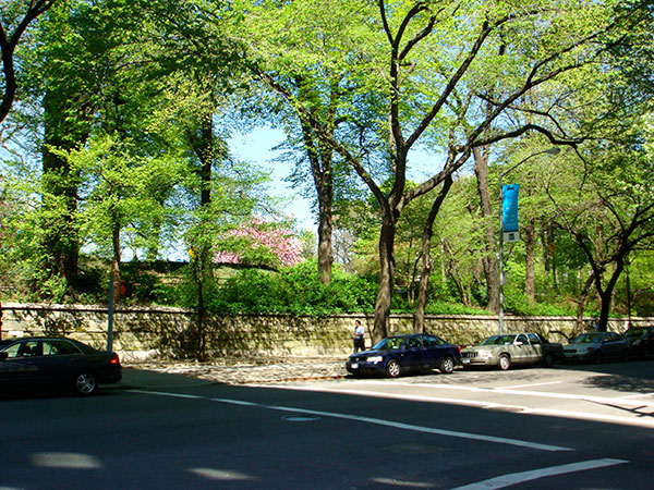
I had the good fortune to meet New York City interior designer Tamara Matthews-Stephenson on Facebook. Tamara, author of the blog Nest by Tamara, offered to meet for coffee at the Le Pain Quotidien (Daily Bread) on Madison Avenue and she’d give me the scoop on places I as a designer would want to see. She even advised me to have my taxi driver take the route through Central Park, a touch I very much enjoyed. I was pleasantly surprised by how many trees are in Central Park and all of them are covered with spring green leaves.
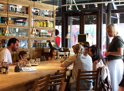
Pain de Quotidien is a Belgian chain that feels like a neighborhood cafe/bakery, with a long central rustic wooden table where people eat together, surrounded by small tables for more intimate conversations. There are a lot of them sprinkled in the city.
Tamara discreetly pointed out Yoko Ono who was also dining, which was very cool. I’d just referred to her Smiling Face Project in my post here and there I was looking at her smiling face. She looked peaceful and content. Over good strong coffee and a savory Quiche Vegetarian, Tamara and I talked so much our meal took an hour and a half to eat.
People make cracks about Facebook (like my husband, who likes to refer to my “hundreds of close intimate friends”) but the fact is that friendships begin somewhere, and Tamara and I realized that we have much in common besides our passion for interior design. I couldn’t have asked for a better way to be introduced to New York!
Tamara (accent on 2nd syllable) graciously gave me a tour of her neighborhood, the Upper East Side of Manhattan. While I’d thought of the Upper East Side as a bastion of the incredibly wealthy, she explained that while there are indeed very rich and famous inhabitants, they live within a select area of the UES. Not that residing anywhere in Manhattan is inexpensive.
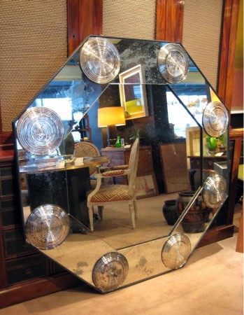
I told Tamara I especially wanted to see the architecture and visit the shops (like any good woman) but the shops I wanted to see were for antiques and home decorating (like any good interior designer/decorator). Tampa has many wonderful attractions, and we love it here, but good home decor shops are a bit scarce (although I will feature one of my faves in another post). She took me first to Gerald Bland, at 1262 Madison Avenue, an antiques dealer with a charming welcome and an array of intriguing antiques like this Art Deco mirror:
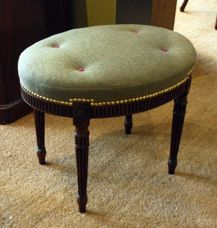
and this Adam Mahogany Oval Bench, circa 1780, that with its nailheads, tufting and pink/green color palette show that good design truly is timeless.
If you are a fellow lover of Albert Hadley, stop in to see the collection of his sketches
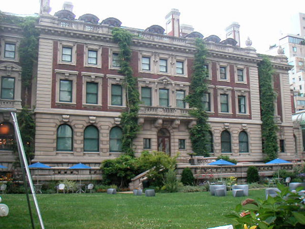
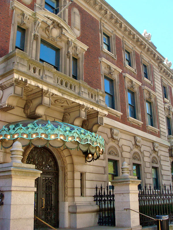
Before exploring Gerald Bland, we first walked by the Cooper-Hewitt National Design Museum on Museum Mile at the corner of 5th Avenue and East 91st Street, across from Central Park, in what is now the Carnegie Hill Historic District. As the “only museum in the country devoted exclusively to historic and contemporary design,” this is one reason I must return to NY.
The Cooper-Hewitt museum includes the 64 room mansion built in 1899-1902 which began life in the mind of Andrew Carnegie (properly pronounced kar NAY gee) and his wife Louise, who was 22 years his junior, as “the most modern, plainest and roomiest house in New York.” Designed by NY architects Babb, Cook & Willard, it was modeled on a Georgian country house and situated on a relatively large amount of property far north of his peers’ residences. The reason for moving so far north was to have enough land for Louise to garden and so the mansion could be a light-filled home in which to raise their young daughter, Margaret, who was born when her mother was 40 and father was 62. I am drawn to natural light filled rooms myself, so I think it was a wise decision <wink> Once Carnegie retired in 1901, the home also served as his place to oversee his numerous philanthropic projects, which included many donations to free public libraries across the US and cultural and educational facilities in the US and Scotland.
Click here for a fascinating look into their life together. I was pleasantly surprised to learn that Carnegie’s favorite Scotch is also mine. And their very special “alarm clock” was a novel way to greet the morning. It certainly seems the Carnegies had a happy marriage. Maybe it’s the romanticist in me, but if a couple has a happy marriage, I can’t help but believe them to be good people. I found one of Louise’s traditions charming: she had her dinner guests sign the linen tablecloth, which she then had embroidered and preserved as a souvenir of the evening. Besides the honour of having one’s name embroidered onto a tablecloth, I’m sure the guests were even more careful not to spill their wine. I think asking my dinner guests to sign their name on a linen napkin and having it embroidered for them as a gift would be fun.
Although the home was considered modest because it was clad in brick vs. limestone, it had many modern innovations such as a steel frame, central heating, a form of air conditioning, telephones, and a passenger elevator. I adore Georgian architecture and think the mansion is beautiful; I actually prefer the juxtaposition of brick with stone. What about you?
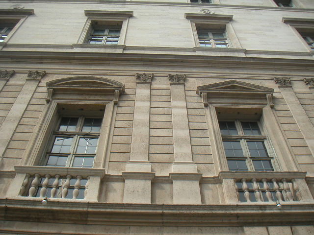
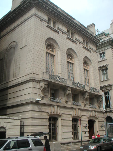
In contrast, this mansion, built in 1918 on the opposite corner of 5th and 91st was the “largest mansion ever built in Manhattan.” After their marriage in 1896, Otto Kahn and Adelaide Wolff commissioned renowned architects C.P.H. Gilbert and J. Armstrong Stenhouse to build their private home. Sparing no expense, Kahn, a German born investment banker, said that it was a sin to keep money idle, a sentiment that would certainly help today’s economy. The Landmarks Commission designated the Otto and Addy Kahn House as the finest Italian Renaissance style mansion in New York. Made from French limestone imported from St. Quentin, the house was modeled after the Papal Chancellery in Rome.
The 2nd floor exterior pilasters and the alternating pediments illustrate the classic beauty of 16th century Italian architecture. But a novel feature of the mansion is the deep winding courtyard that brings light and air to the interior.
Considered the most influential patron of the arts known to America, especially of music, architecture, and painting, Otto Kahn often held concerts and exhibitions at his home for the public. He had his 2nd floor music room designed with an Adam ceiling lit by a crystal chandelier but search as I might, I couldn’t find a photo of it. The acoustics were excellent, and musicians George Gershwin and Enrico Caruso were among his guests, with Caruso once using the music room as a recital hall. To read more about the fascinating Otto Kahn, click here.
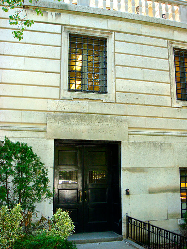
After Kahn’s death in 1934, Addie sold the mansion to the Convent of the Sacred Heart, the oldest Roman Catholic private all-girls school in Manhattan, as well as one of the most selective and expensive.
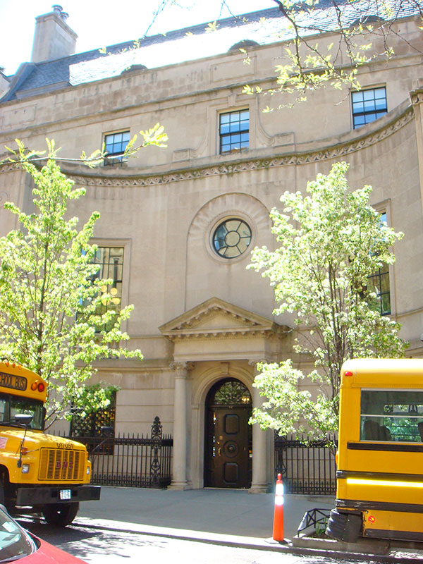
In the 1940s the school expanded next door into the James A and Florence Sloane Burden House next door. Florence, great-granddaughter of Commodore Cornelius Vanderbilt, loved to entertain lavishly. Designed in the Italianate Renaissance style by the architects of Grand Central Station, Warren & Westmore, the 3rd floor ballroom, banquet hall and reception room were modeled after the Hall of Mirrors of Versailles, with 12 foot high doors paneled with oblong mirrors surrounding the ballrooms. This suite of 3 rooms is cited as the finest Beaux Art townhouse rooms in the city and the home was designated a historic site in 1974. Notable guests include Mark Twain and Giacomo Puccini. It must have been convenient for Mark Twain since he was also a friend of Andrew Carnegie just across 91st Street. The home now houses Sacred Heart’s lower school.
Graduates of Convent of the Sacred Heart attend some of the most rigorous and highly respected colleges in the nation, such as Harvard, Yale, Princeton, University of Pennsylvania, Georgetown, Stanford, University of Chicago, and many more. Notable alumnae include many women from the Kennedy family including Caroline Kennedy, Ethel Kennedy, and Eunice Kennedy Shriver. Other notables include Gloria Vanderbilt, Stefani Germanotta (Lady Gaga), and Paris and Nicky Hilton. With annual tuition at 30,000+ for higher grades, it’s quite a commitment.
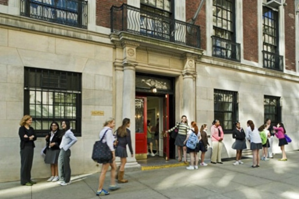
Margaret Carnegie attended another highly selective and expensive private school, The Spence School. When the school needed a playground, the Carnegies donated their tennis court for that purpose. Years later, the school added a building on the lot but put a playground on the roof of the building to meet the gift’s stipulation. The Spence School is one of the oldest private girls schools in Manhattan. Founded in 1892 and located on East 91st St., it was ranked 6th most successful school in the country in placing its graduates in Harvard, Yale, and Princeton. You may recognize the names of some of its more notable alumnae: Gwyneth Paltrow, Helen Clay Frick, and Marjorie Lake Post. This is a photo of the 93rd St. building which houses the lower grades K-4 while grades 5-12 are housed in a building on East 91st.
The visit to the Upper East Side will continue with shopping and more!
New York City Here I Come
The Journey to New York City (a virtual experience for the New York neophyte)
When my husband told me he needed to go to New York City for business, I jumped at the chance to tag along. While he was in meetings all day, I’d explore NYC from a design perspective and see some of the fabulous architecture, shops and sights and naturally, tour the design center. Considering that we used to live in southern NJ (or South Jersey as we call it), it’s a sad fact that I’d only been to NY a couple times. The first was when in college, I took a chartered bus trip to see Rudolf Nureyev dance at the Metropolitan Opera House, but afterward we had to get right back on the bus. After seeing him dance, I was totally mesmerized and wouldn’t have been able to take in anything else anyway, much to the chagrin of my date. Here’s a short video of Rudolf Nureyev dancing with Margot Fonteyn. Don’t say I didn’t warn you!
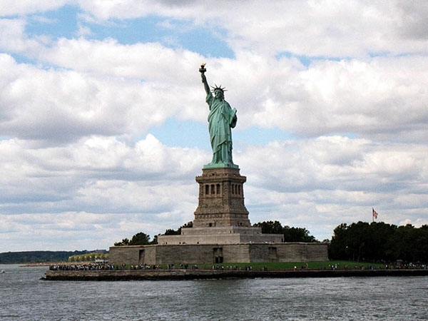
Years later, married with kids, Charles and I decided to move to Florida and realized we’d never taken the kids to New York city, so we jumped in the car and drove off to see the Statue of Liberty. Sad but true, like Joni Mitchell sang, “Don’t it always seem to go, you don’t know what you’ve got till it’s gone” Big Yellow Taxi. Or in this case, till we were gone, to Florida.
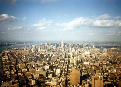
That day there was a demonstration that closed the ferry to the Statue of Liberty. With our plans foiled, we improvised. After turning down a request to buy a Rolex watch that was a steal if only it had been real, we made our way to the World Trade Center, rode the elevator up to the tippy-top and viewed the city panorama from there.
Now of course we’re glad the Statue of Liberty was closed that day or we would never have experienced the wonder that was the World Trade Center. And it gave us another reason to go back; everybody should see the Statue of Liberty once in their lives! After descending and walking around the city in search of food, we ended up at Morton’s Steakhouse where they took pity on us tourists (as witnessed by our jeans, sneakers and SLR camera) and sat us in a dining room full of well dressed business men and women. I was slightly embarrassed to say the least but hunger won out. To this day, I fondly remember the delicious meal but most of all how very nicely they treated us.
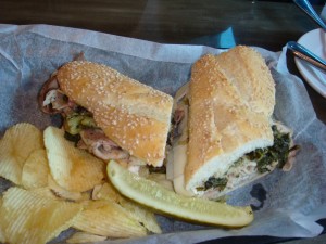
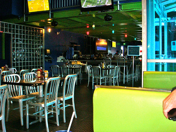
I could kick myself for not visiting New York more often when we lived only an hour or two away. But now I had a chance to make up for lost opportunities. We decided to fly to Philadelphia and drive to NY so that we could tack on a visit to our family in NJ and sneak in a little Atlantic Ocean time too. As a foodie, Charles researched every restaurant where we’d dine and I would pick the show we’d see. Upon arriving in Philadelphia, he took me to Tony Luke’s, whose Italian cheesesteak won Bobby Flay’s Throw Down challenge on the Food Network. It’s become a tradition for him and his pals to pay a visit after their annual men’s retreat in Malvern. Tony Luke’s is part bar, part diner decor, with green faux leather booths and aluminum slatted chairs. We split a roasted pork, provolone and broccoli rabe sandwich, a fabulous combination of flavors that obliterated any thoughts of decor. I’d go back for that sandwich any day.
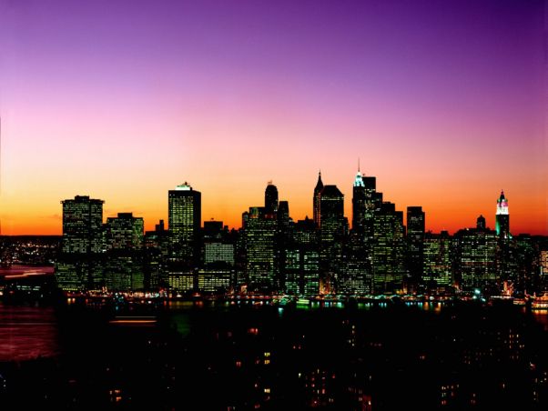
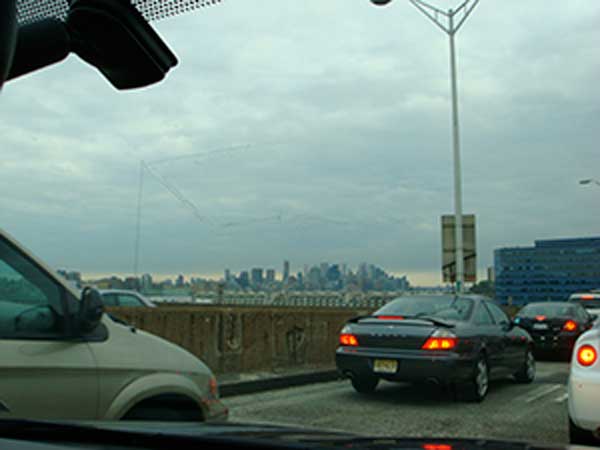
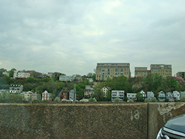
The weather was what we call a New Jersey day: cloudy with no sun. That’s not totally fair because NJ can be beautiful and sunny, and Florida can be overcast and gray too. But that’s what we like to call it. We headed off to New York and made good time until we reached the Lincoln Tunnel. By that time it was 5pm Friday and it took an hour for all the cars, trucks, and big buses with screeching brakes to funnel down into two lanes. Here’s a view of the city which tantalized us while we waited in traffic, and another view of the houses in NJ staring wistfully at NY.
The whole Lincoln Tunnel experience was rather harrowing and driving it was a bit surreal as I hope this photo conveys. That bus seemed mighty close when it was alongside us. Once we saw the light at the end of the tunnel we breathed a sigh of relief — and anticipation.
Arriving in New York (finally)
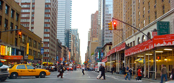
It’d been a long day traveling to get to the city, but once we were in the city driving to our hotel, we both felt the pulse of the city, as if we’d entered a giant beehive, the city buzzing with life. There is something about being in New York city that makes one feel more alive. Not all big cities feel that way. Paris, for example, feels much slower paced, but then, I haven’t been to a city with more energy than NY! Maybe if you live there it wears off, but for visitors it gets the pulse racing.
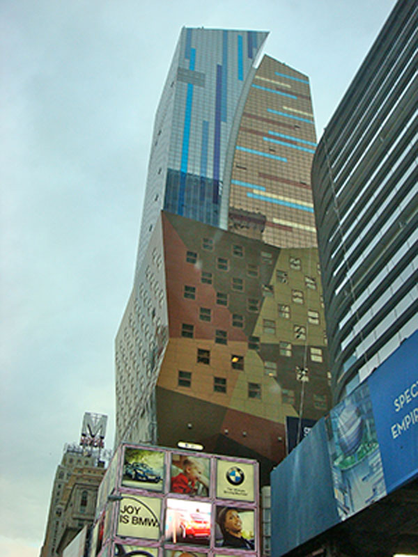
Here is a photo I had to snap not only because I love BMW but also because of the crazy cool building above it.
The southwest Florida suburbs where I live are almost all one story homes, so I felt a little, just a little, like Crocodile Dundee. Not that I haven’t seen tall buildings and skyscrapers before, it’s just been awhile.
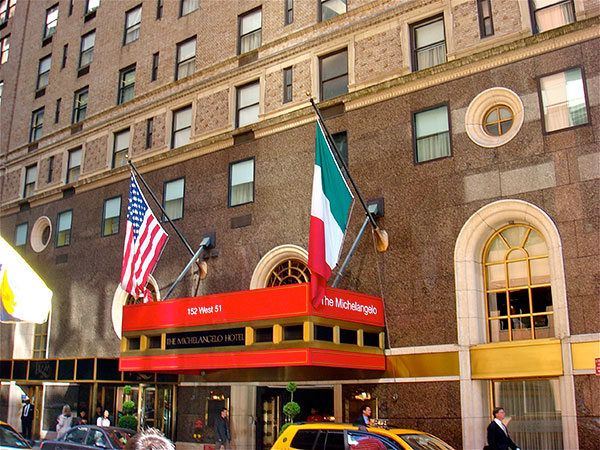
My husband and I stayed at The Michaelangelo, a small boutique hotel on West 51st.
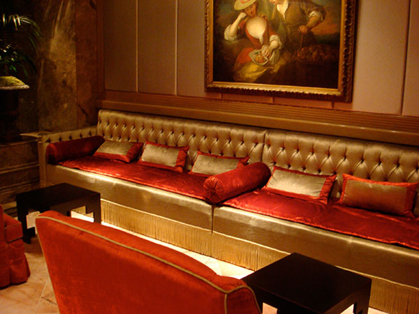
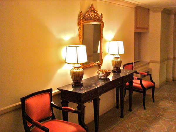
As the name suggests, the hotel is decorated in an Italian style but it’s not overdone. There are a variety of seating areas such as this one for a large party, or smaller areas tucked away in alcoves for a tete à tete
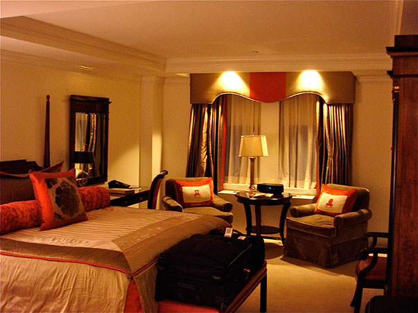
What I look for in a hotel room is not unlike what most people want in their home: the creature comforts for sleeping, reading, enough tabletop surfaces including a desk, storage for clothing, TV and music, good temperature control, a variety of lighting, and a welcoming ambiance. Other must-haves include a full length mirror, a good bath/shower and lots of fluffy towels. Of course I appreciated the layered window treatment: shaped silk cornice with banded silk panels (lined and interlined, yes I checked!) that framed sheer curtains over black out privacy shades. Since window treatments have a special place in my heart, I also appreciated that the panels were floor length, operable and covered the entire window. No skimping here!
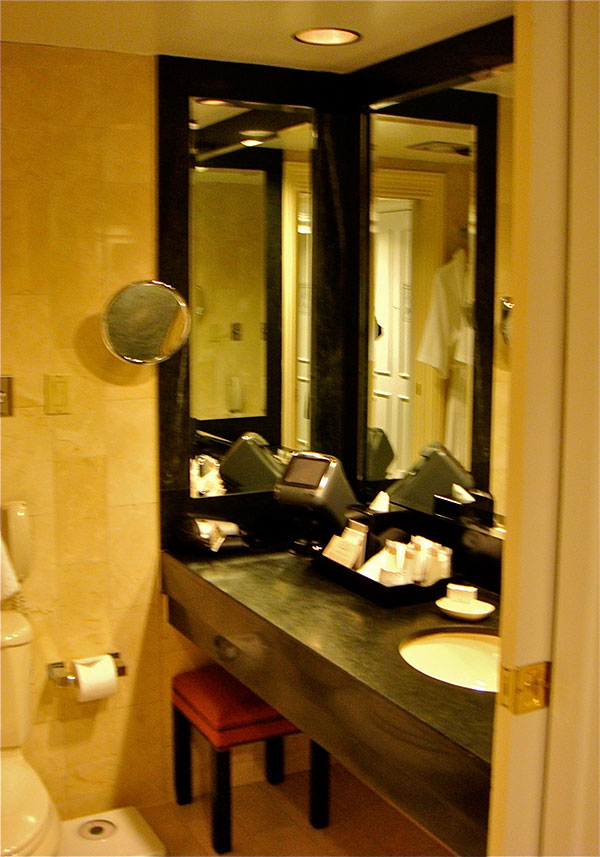
The bathroom had a tub big enough for two, two terry robes, a blow dryer, a deluxe assortment of grooming products, 3 way mirrors, a scale (considering our plans for delicious dining, a scale is the last thing I wanted to see, but would you think its presence created a subliminal message in my unconscious not to over-indulge? Remember I told you my husband is a foodie?) The magnifying mirror was a godsend since I forgot mine from home. Otherwise the cosmetic results would have comedic!
We were very pleased with the room and I especially loved the most comfortable mattress we’ve ever slept on. I seriously would’ve liked to take it home with us- and our mattress at home is no slouch.
Next: Touring the Upper East Side with Tamara

